



 |
| Tel: +61 423 601 604 - Email: architect@andrewtboyne.com |
|
|
||
 |
||
|
Hardy Road Residence Bayswater - Unbuilt - 2010 |
||
|
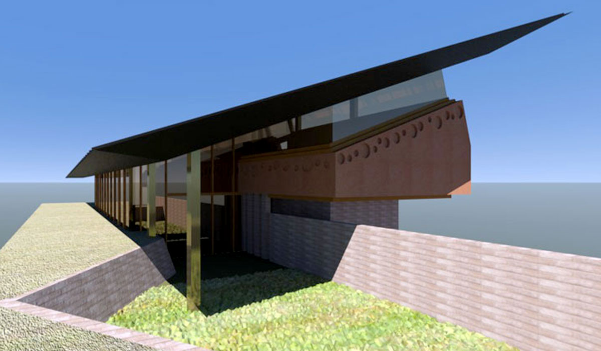
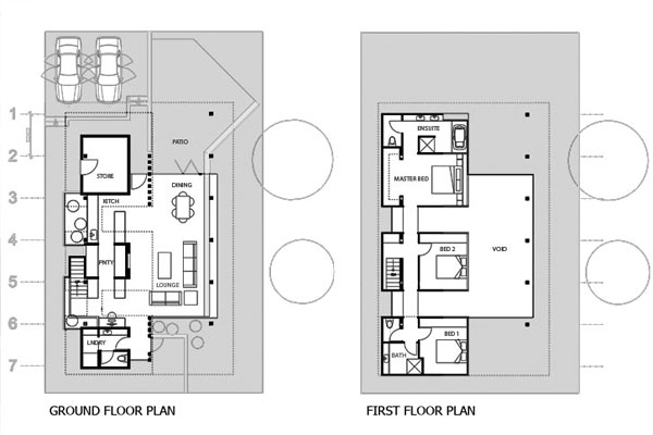
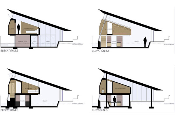
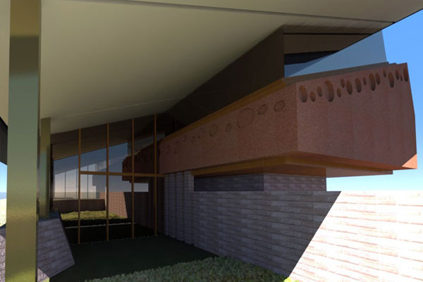
The suburban location of the site is not particularly beautiful, and there are no real views to take advantage of. In order to create a healthy environment, the intention was to create a building that looked inward, while also trying to break down the definitions of the interior space, so that the exterior flowed through the interior, but the focus of the building was not overlooking the unpleasant surrounds. To achieve this the building is broken up into distinct elements. The ground floor which is dug below grade 800mm accommodates the main public spaces of the house, while the three bedrooms are located on the second floor. Each bedroom is accommodated in its own "pod" which are connected by bridges. The walls of each pod stop 1000mm below a single the single roof canopy that floats over the entire structure. This allows for a flow of space through the building and ensures that it feels as a uniform space. The floating canopy also breaks, unobstructed through the glazing which helps to break down the definition of the interior. |
||
 |
 |
|
|
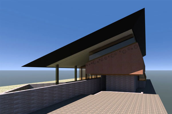
The pitched roof is brought down low to ground on the North Eastern side of the structure to shield the interior space from direct sun, but to also obscure views to the adjoining house. A garden bed moves from the interior through to the exterior and would be heavily planed to further obscure the view. The wall of the garden bed runs the length of the interior, and out through the glazing to form the grassed font yard, breaking down spatial definitions. A series of columns is separated from the glazing line and continues its rhythm outside the building to support the covered canopy, continuing the breakdown of the enclosure. The South East side is two stories high, and between the pods is adorned with obscured and operable glazing to block views to the adjacent property while also catching the afternoon sea breezes. The building uses simple materials such as concrete floors, concrete block walls and cement render pods. Because if the exorbitantly high building costs in Western Australia it was imperative to design a building that was as simple as possible so as to keep the costs down. The building uses a vast amount of glazing, but a significant number of windows are operable, and the wedge shape, with its orientation should draw a steady flow of air through the house. |
||
 |
 |
|
|
There has been considerable thought about how the interior space can be turned into a sort of garden, and planter boxes have been designed into the structure. This helps bring the sense of nature through the structure in lieu of a desirable environment surrounding the building. In all, the building utilizes Box Theory to create an internal looking environment that is not governed by strict definitions of interior and exterior. |
|
|
 |
 |
 |
 |